The Pantone Color Institute has spoken and designated Greenery as the 2017 color of the year. “A refreshing and revitalizing shade, Greenery is symbolic of new beginnings,” the institute says.
While Edina loves green, this hue news doesn’t dictate that homes be awash in the yellow-green shade. But adding a pop of Greenery can add restorative sensibilities to a home’s décor. “Illustrative of flourishing foliage and the lushness of the great outdoors, the fortifying attributes of Greenery signals consumers to take a deep breath, oxygenate and reinvigorate,” Pantone notes.
Considering making a Greenery splash? It may be easier than you think, as Greenery plays well with other hues. “You can incorporate the color Greenery into almost any color scheme,” says Tim Ricker, interior designer and general manager of At Home and Co. (Ricker is partial to neutral palettes with Greenery accents.) “Green-toned spaces are easy to work with because it is a color that comes from the Earth, therefore it pairs very nicely with many tones, especially neutral tones,” Ricker says.
“Green is that common thread that ties everything together,” Mark Masica, Hirshfield’s color services manager, says, adding, “Green (not Greenery) is now looked upon as a neutral.”
Fully committing to the “it” color of the year may not be everyone’s idea of wise design judgment. “It is difficult for us to express the Pantone color of the year to our clients, as we feel it is a fleeting trend,” Ricker says. While it may be tempting to be on trend, Cindy Abramovitz, senior interior designer with Gabberts Design Studio and Fine Furniture, counsels, “When you do design work, it should be timeless and what makes you happy,” she says, adding, “What’s current today will be passé tomorrow.”
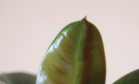
That’s not to say the color isn’t making a statement. “We are seeing the Pantone color of the year, Greenery, in many of our fabric vendors’ spring previews,” Ricker says. Add accessories, he says, such as pillows, throws and art, as effortless ways to incorporate Greenery into living spaces. “We are definitely on cue,” Abramovitz says, noting fabrics and accessories featuring Greenery have landed at Gabberts. She also recommends using plants to add pops of the color. “It’s a refreshing way to keep summer alive,” she says. Who doesn’t want a sprig of summer year-round?
Masica says wallpaper can also serve up a hit of Greenery. Originally, wallpaper was utilized for accent purposes. Much later, in the 1970s and 1980s, many homes were blanketed in wallpaper, a look that mostly went out of favor in the 1990s to early 2000s, Masica explains. “Now, ironically, we see wallpaper returning to its roots as an accent,” he says. Use it in a powder room, on a room’s main wall (highlighting a bed or fireplace) or even on a ceiling—all ways to welcome this year’s color cue.
Whatever way Greenery is utilized, Masica says, given Midwesterners’ design sensibilities, it will probably be “lightened up and toned down to make it a more livable color” once it makes its way into local homes.
Regardless of which color rises to the top of any list, don’t throw the design baby out with the bathwater. For those who’ve committed to a decidedly more neutral aesthetic, neutrals are still playing a broad role in homes, according to Ricker. “Yes, it is still holding true,” he says. “We are now moving away from the grays and onto earth tones.”
The meaning behind the Pantone Color Institute’s Color of the Year designation is symbolic, providing
a portrait of the tenor of the world.
Previous colors for the last 10 years include: rose quartz and serenity, marsala, radiant orchid, emerald, tangerine tango, honeysuckle, turquoise, mimosa, blue iris and chili pepper.


