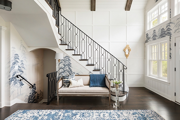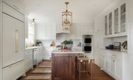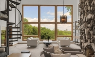
While often overlooked, the entryway is the place that welcomes people, and in some cases, might be the only place visitors see. So, it’s important to use design features that help organize and brighten the space in order to make the best first impression. Consider incoporporating these design tips:
Cut the clutter—Entryways are often a landing space for kids, guests and even pets. It’s too easy to let piles stack up. Make sure everything has a place. If you drop your mail there, make sure you have a bin or basket to put it in. If it’s the place you remove your shoes, perhaps consider a rack or shelf for them. Have hooks for coats. The key is to keep the space as organized as possible for a welcoming feel.
Entryways also tend to lack a place to sit. If you have the room for even a small bench, this creates a convenient spot to slip on shoes and can feel more welcoming. A bench with shelving can also double as a clever storage solution.
Reflect light by incorporating mirrors to open up a tight space. Entryways are notoriously tight in many homes and often lack adequate light. Bounce some brightness into your entry with a stylish mirror.
If you do have enough natural light, place a plant or fresh flowers in the space to welcome guests. Also, a diffuser or candle can provide another welcoming sensory experience.
Think of your entry as a personal space and the first impression people get when they’re welcomed into your home. When you think of it this way, you’ll begin to see how visitors feel when they walk through your front door.


