Many families daydream about someday building a custom home. But when an opportunity arises, the myriad architectural and style choices can confound even the most sophisticated homebuyer. One Edina family who wanted to build a cottage-style home in the Rolling Green neighborhood employed a collaborative approach to achieve the best outcome. Their team included architect Damien Lindquist of Sharratt Design, homebuilder John Kraemer of John Kraemer and Sons, and interior designer Linda Engler from Engler Studio Interior Design. Together, these experts helped strike the perfect balance between rustic and refined in this captivating cottage home.
The Exterior
Cottage-style homes are extremely popular in Minnesota, where many people appreciate warm environments and traditional styling. But according to Lindquist, there can be a lot of variety within the cottage style, and this particular family wanted a different spin on their cottage design that would include many modern elements. “They were looking for more of a mountain rustic feel with some modern sensibilities,” Lindquist says.
Steep roof pitches common in cottage style are accentuated impeccably in this design with a combination of dormers and gables. Lindquist also had fun incorporating big brackets and corbels to complete the home’s lodge-like exterior image.
A combination of stone and stucco embody the cottage look and provide the homeowners with a mostly maintenance-free exterior. A cedar shake roof caps this design with a look that’s both natural and visually appealing.
The oversized windows not only let in a lot of natural light, they are one of Lindquist’s tricks of the trade to help make a larger-scale home appear smaller from a distance. “You could have the same house with three times as many smaller windows but that would make it feel more massive,” Lindquist says.
Large homes also often equate to lots of kids and cars. By incorporating an L-shaped garage, the total number of garage stalls is less visible from the street and therefore doesn’t distract from the overall design. And by tucking the front entrance of this home left of center instead of smack in the middle, one is able to take in the entirety of its beautiful façade instead of zeroing in only on a large front door as a focal point.
The Interior
Unobstructed living and dining spaces have become more the norm in home design. This house is no exception. A large great room is seamlessly connected to the kitchen and dining area. “Homes are much more about togetherness and are less compartmentalized,” Lindquist says. “As families have more demands on their time, time together is precious.”
Kraemer agrees. He says, “A less walled-off dining room means the space will get more use than just at Thanksgiving.”
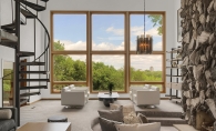
Even better is the natural flow from the living room to the kitchen to the dining space and out to a screened porch with a wood-burning fireplace. Bifold doors can be partly opened to help control air flow or completely opened for a seamless environment between the kitchen, dining and outdoor spaces. The design is beyond perfect for entertaining.
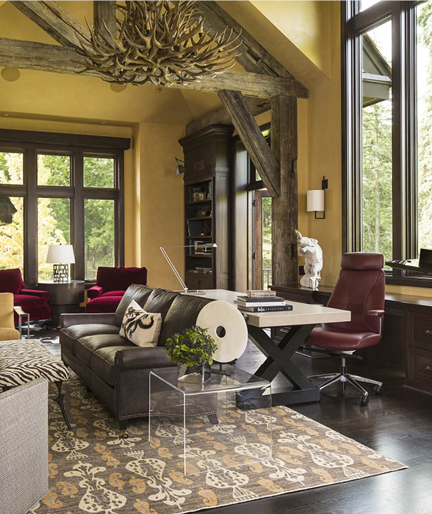
A full-size office with a wood-burning fireplace and an antler chandelier provides a masculine, lodge-themed space for getting work done, while a smaller home office is tucked away behind the kitchen area for storing cookbooks, paying bills or checking email, or for use as a kids’ computer station.
Throughout the main floor are reclaimed wood beams from Manomin Resawn Timbers in Hugo. Engler says they could have gone with box beams, but the authentic timbers complete with nail holes and exposed old mortise and tenon joints take the combination of rustic and refined over the top in this home. “The combination feels great in the space,” she says.
Lindquist is equally excited about the hand-hewn timbers in the home. “It’s played off like a sculptural element, like they built into an old timber-frame barn and then went modern with [the interior design] but left these rustic elements poking through,” Lindquist says. He was equally excited about the large skylight installed over the dining area. “We don’t do a lot of skylights because of concerns about condensation and heat loss,” says Lindquist. But this ridge skylight was fabricated and installed as one big piece to let in tons of natural light, and nothing else.
The second floor has two bedrooms and the lower level provides endless entertainment options with a game room and a television viewing area divided by a doubled-sided fireplace.


Rustic & Refined
When couples are split on design preference, it’s the task of the design team to make both people happy. In this case, the couple wanted a mix of rustic and refined. So the team incorporated elements of both. “We threw the rules out the window and tailored this home to this particular couple,” Engler says. Part of this perfect balance was achieved by using some stained millwork and casing, some enamel, and in some places, a combination of the two finishes.
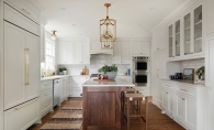
Kraemer appreciates some of the more unusual touches in this home like the alligator-look wallpaper in the guest bathroom, the mix of modern and traditional lighting throughout, a solid-marble kitchen counter and backsplash, and a pressed-grass material used in a lower-level countertop. Also, “lots of clients typically request appliances with custom cabinet fronts,” Kraemer says. But this couple opted for exposed stainless steel appliances, in another nod to some of the home’s more modern elements.
The main-level master suite has floating vanities and glass mosaic tile, while a daughter’s upstairs bedroom has a violet accent wall and a sparkly chandelier.
The cable rail stairway is another cool surprise, according to Lindquist. The original plan was for wooden balusters but the change provides something unexpected, and now the space makes a truly modern showcase for an art collection.
The biggest design challenge, according to Engler, was volume. “This is not an aloof family,” she says. So she wanted to make the large living spaces have a sense of intimacy. This was achieved through texture and scale. A chunky wool rug rests under large furniture pieces in the great room. “Little things would get swallowed up in the space,” Engler says. The color palette is primarily neutral solids without much use of pattern. Pops of color come from pillows, ottomans and artwork. According to Engler, even homeowners with smaller spaces don’t need a whole lot of pattern or color to make their space interesting or layered. She says, “Sometimes it’s nice to let the architecture do the talking.” This home does just that–it speaks. It tells the story of an Edina family’s lifestyle, an intertwining of traditional and modern achieved through collaboration.


