“I love to entertain and everybody always wants to be in the kitchen,” says Deborah Eckland of Edina, who with her husband Jeff built their Edina home in 1999. “I love to have people in my home, make a big pot of something and just be together.” After hosting a party where her guests were crowded in a corner and some even sitting on a cooler, the homeowners knew it was time to make some changes in the kitchen.
“I also watch way too much HGTV, and thought, ‘oh my gosh, if they can do that with that flop of a house, I’m sure they can do something to make this one more functional,’” says Eckland.
They enlisted Vujovich Design Build to complete their remodel.
“When we built the home 20 years ago, we weren’t as established as we are now, and so we picked more builder grade finishes,” explains Eckland. “We strongly considered whether to buy a new house, downsize and get a condo or remodel, and we decided we really love our location and our neighbors.”
An Award-winning Kitchen
The original kitchen had stock honey oak cabinets that did not maximize the existing 10-foot ceilings and lacked crown molding. There was a small island with a white Corian countertop that didn’t offer much in the way of seating or counter space. However, the great room was expansive.
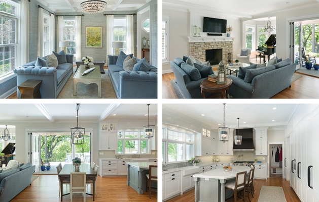
With some reworking, the team at Vujovich transformed the existing space to create the Eckland’s dream kitchen. The result is an elegant area as refined as it is welcoming and comfortable. The project was also recognized with a Contractor of The Year (COTY) award for the best kitchen over $150 thousand by the National Association of Remodeling Industry.
“The project was unique for us as a company because it was a newer home, but it lacked some architectural features,” says Beth Malmberg of Vujovich Design. “Deborah is from the south and she wanted it to have this southern charm of a true red brick Georgian home, and we were able to add more character to make it really feel like that.”
The kitchen remodel was a part of an entire home makeover, and the project took about four–five months. The Ecklands, along with their high school aged son, moved out of the home during the remodel.
Creative Design
For this remodel, the footprint of the existing space was maintained, however the window and door placements were reworked and shifted downward to increase the space available for kitchen cabinets and countertops.
“We essentially rebuilt the entire back wall of the home. There was a bump out where the kitchen sink was, and we took that away to make the classic architectural style more appropriate. We moved the windows and sink to another location that allowed the kitchen to feel more gracious,” says Malmberg. “She wanted the home to be really elegant but to be able to have people comfortably come in and feel welcome and at home.”
“The thought of moving windows so there would be more cabinet space never occurred to me,” says Eckland. “I never thought my kitchen could be as functional and nice until they started putting it on paper for me.”
To improve the flow, they also removed the walk-in pantry and created a 16-foot wall of pantry cabinets including the refrigerator/freezer with cabinet face and reworked the butler’s pantry.
This allowed them to add a large furniture-style island in the middle of the space, with turned legs in a soft slate blue, and a double thick Cambria countertop, with seating for four.
The 3-inch plank oak floors were refinished in a deeper stain. The cabinets enameled in a classic white. New custom cabinetry creates a grand feel and offers an increase in storage. Worn glass fronts with lighting help showcase items. The space also features new appliances, a farmhouse sink and is adorned with grand light fixtures.
“We tend to work in a lot of older homes in the lakes area of Minneapolis and so a lot of our stuff is kind of a nod to the past and the white classic kitchens are something we do. But we also do them in fun grays and greens and fun paint colors sometimes, too, or in riff oak,” says Malmberg.
Southern Charm
To increase that Southern charm and feeling of a classic Georgian style home they intended, the team at Vujovich made interior and exterior changes to improve the authenticity of the style the homeowners were looking for.
“It still is a very large space without definition between rooms, but we used slight eyebrow arches throughout to help define the spaces. There are arches in the cabinetry, the valance over the kitchen window and an archway over the new pantry wall,” says Malmberg.
They also added more architectural elements like beefy crown molding and beams, creating giant coffers on the ceiling.
“There’s lots of wood craftsmanship in this home, and it makes the home feel more substantial and has heft,” says Malmberg. “They are all painted white enamel just to be silent and quiet and calm.”
The team also replaced a standard patio door with impressive bifold doors that have full-view sheets of glass and open from the casual dining area in the kitchen onto a huge back porch overlooking a lake.
“This really improved the connection to the outdoors,” says Malmberg. “The porches were just as important to her as any other element in the home.”
Eckland says she takes credit for this one feature. “I have been carrying around an ad for these Marvin doors for years, and I just love it,” she says. “I always thought it would be so cool to open from the kitchen onto the porch, and have this indoor/outdoor living. We do have a lake, you’d think it would be full of mosquitos, but they just don’t come up high and we can leave the doors and windows open. What they’ve done has made
it perfect for entertaining.”


