Homebuyers usually have a long wish list, and it’s a tall order to find everything in one home that will stand the test of time, as families grow and needs change. These two young families found that a solid home in a great Edina neighborhood, coupled with a talented remodeler, is a match made in homeowner heaven.
Combining Classic and Custom
After relocating from Colorado, Michele Tafoya and Chris Walton set out to find a dream home in Edina for their growing family. With their then 3-month-old son Joseph in tow, they saw 40 homes in four days. No. 40 had the desired curb appeal, yet lacked many elements on their wish list. So their real estate agent suggested a remodel.
“When we walked in [our agent] saw the vision of what it could be,” Walton says. The small home had great character and a huge backyard that would allow remodelers to bump it back.
The Cape Cod Colonial-style home, built in 1940, sits on a beautiful tree-lined street. Close to Arden Park, the 50th and France shopping district, and Edina’s excellent schools, it’s a great location for this young family.
The homeowners’ vision was to maintain the aesthetic integrity of the house while adding enough space for the family to be comfortable. “We spent a long time moving around, so we said, “Let’s make sure [this home] has got everything, the right amount of bedrooms and bathrooms,” says Walton.
In order to preserve the home’s character, the front third of the house remained largely untouched. The formal living room was updated with new tile around the fireplace, and neutral gray tones on the walls, and the carpet was removed to expose the original hardwood floors. The den was spruced up by refinishing the millwork to create a cozy reading room. The back half of the original house was renovated and expanded, adding on 2,400 square feet with a three-level addition.
“Older homes like these have small rooms that are compartmentalized,” says Chris Easterday of CRE Construction. The kitchen was relocated to the center to make it the hub. This created an open-concept kitchen with dining and family rooms on the main floor. The kitchen features a dramatic island with gleaming white Cambria quartz countertops. Two clear glass orb pendant lights bring fun personality into the space. Custom white enamel cabinetry coupled with panel-covered appliances impart a clean and streamlined look and offer ample storage. “We love to be able to be in the kitchen and still be able to see the kids,” says Tafoya.
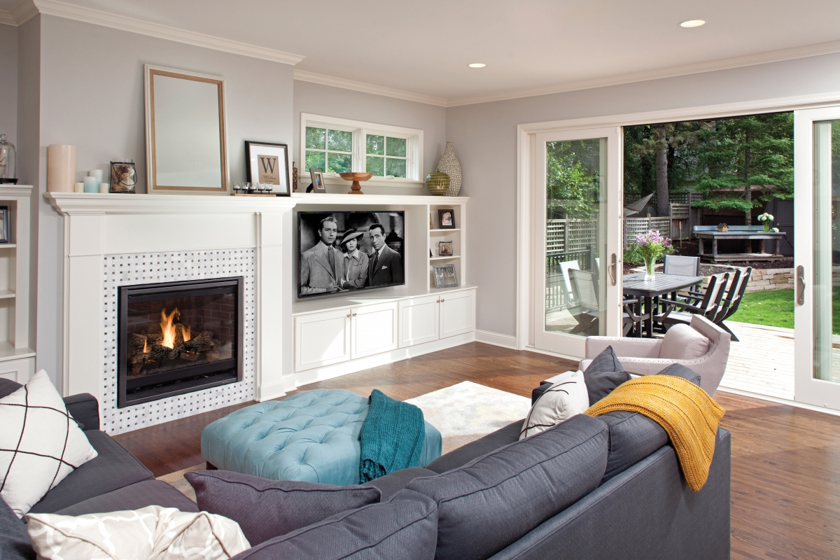
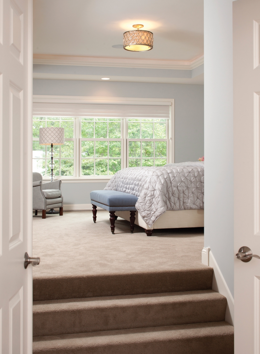
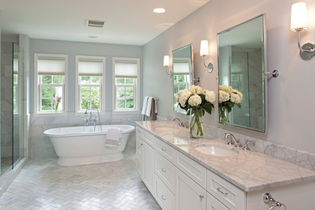
Left: A new family room with walk-out patio. Center and right: Master bedroom/foyer and master bath. Photos by Jon Huelskamp with LandMark Photography
Natural light floods the warm and inviting great room that opens up to a newly landscaped backyard and deck. And at dusk, custom window treatments spanning the great room’s back wall of windows can be closed via remote control for easy privacy.
The lower level includes a fitness room, home theater with stadium-style leather seating, and bar and game room for watching football and playing cards. A sunken living room adds ceiling height. And a small finished storage space has been converted for little Joseph to use as his secret hideout.
On the third level, double doors open from the hallway to a small foyer and a set of three steps leading into the new master suite. “The stairs were a trick that allowed us to gain 9 ½ ft. ceilings in the great room,” explains Easterday. The new design also captured unused attic space to make his and hers closets in a spa-like master bathroom with stunning marble finishes, a freestanding soaker tub and a shower with glass doors.
“We designed on a budget considering Joseph was 18 months and we had another baby coming,” says Walton, who runs home furnishings for target.com. He challenged his team to design as many of the rooms as possible using only target.com items. “I was so happy,” Tafoya says. “I was pregnant and not feeling great, so when Chris came up with the idea for his team I was like, go for it.” The juxtaposition of fresh and trendy home styling with the home’s vintage elements evokes the casual, traditional style the couple was looking to achieve.
Framed blueprints of the original home hang in the living room as a reminder of its past, but Michele and Chris, who welcomed their second child, Richard, in December, look forward to making new memories in a home that meets their needs.
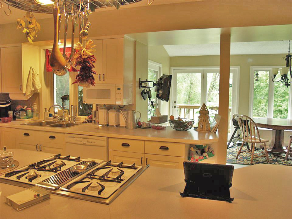
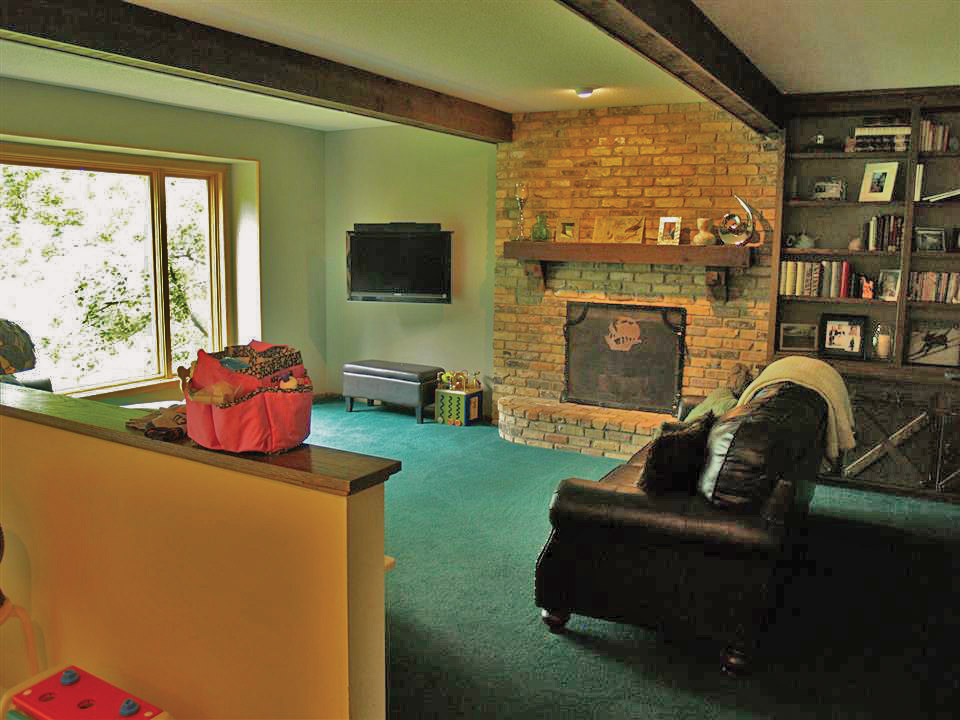
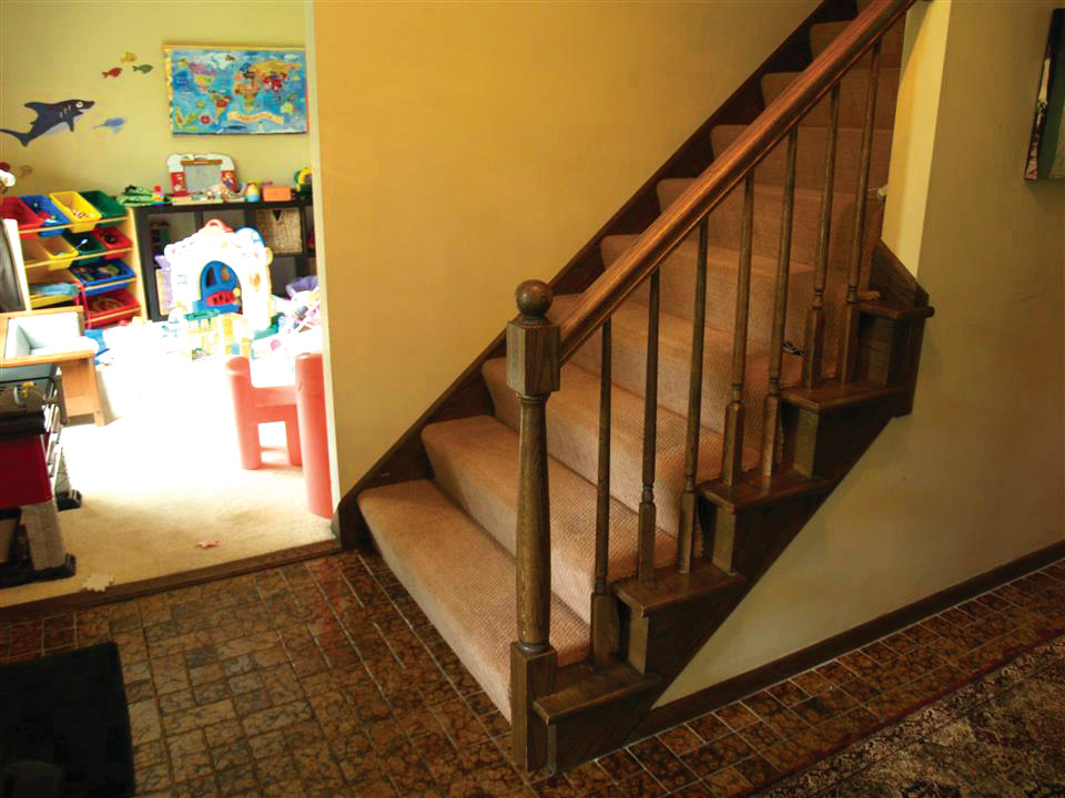
The Brown home before a three-month renovation.
The Next Generation
As Ricky Brown’s parents readied to downsize their empty nest, he knew that buying his childhood home was an option. So when he and his wife Angela discovered baby No. 2 was on the way, they decided to exercise the option. But the home, built in 1978, was in need of an update.
“When we bought it, his parents we’re like, ‘Gut it, we don’t care,’ ” Angela says. “We knew that certain things needed to be done; we were just thinking and mulling, what do we do? Do we do something big?” Then the Browns saw a home remodel story in Edina Magazine about a house on [the same road]. “And I [said], we can do this!” Angela says. So the couple hired Vujovich Design Build Inc., the same company they’d read about, to complete their remodel.
They lived in the basement during the three-month renovation of the home’s first floor. “They really wanted to make the layout more comfortable and flow from room to room for a more modern and open lifestyle,” says Beth Malmberg, project director at Vujovich.
Family memories surfaced during the process. “When we were taking wallpaper down, we definitely saw a growth chart, and I was more emotional than Ricky was,” says Angela. “He said, paint it!”
“To be honest there were a lot of things I always wanted to change, little things that always just bugged me about the way stuff was laid out,” Ricky says. Structurally, narrow doorways were widened, and some elements were removed, such as soffits, a half-wall between the kitchen and family room, and the classic 1970s wood beams on the outdated popcorn ceiling. “It was very dark before,” says Angela. The home was lightened and brightened with light gray paint, new white woodwork and additional recessed lighting. A new front door was added in the entryway, and old tile was replaced with wood flooring throughout to give a consistent and unified plane. A wooden stair railing was also updated to provide a clean, streamlined look.
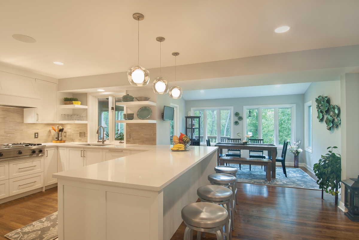
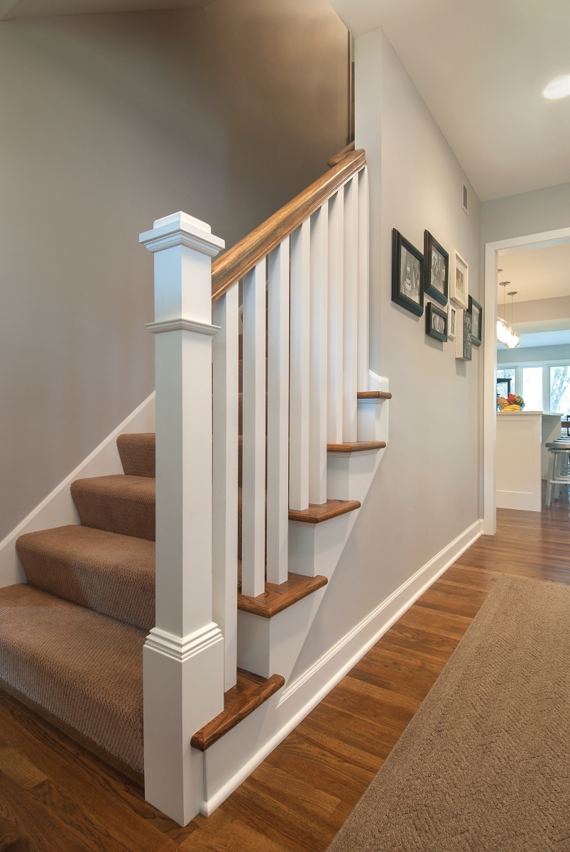
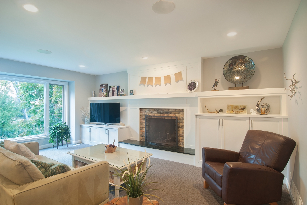
The Brown home after renovation. Right photo courtesy of Vujovich Design Build.
The original kitchen was always congested, so the goal was to open it up to make it easier to socialize and cook. Cleanwhite finishes complement the modern backsplash. Sleek pendant lights over the peninsula counter and industrial-style stools add to the modern Scandinavian look. Ricky and Angela’s favorite space off the kitchen has a casually elegant farmhouse-style table that was able to fit after swapping a rarely used door to the deck for a window. And by closing a wall from the kitchen to the original formal dining area, the room was repurposed into an office for Angela, who works from home full time. “We are definitely seeing people turn formal dining rooms into other spaces; people just don’t live that way anymore,” Malmberg says.
Dark green carpet was removed from the family room and new built-ins give the space a focal point that coordinates with the kitchen. “The fireplace was probably the one sticking point Ricky and I had,” Angela says. “He wanted to use the Chicago-style brick original to the house, so we compromised.” The result was to add a wood surround that partially exposes some brick, paying homage to the original design.
The doorway to the formal living room, or, as Ricky calls it, “the room we weren’t allowed in as kids,” was widened and re-carpeted, which helps bring in a lot of light and makes the entire first floor into a multifunctional space this family of four can use to entertain, watch TV or enjoy a Lego building session.
As for what the rest of the family thinks of the changes? “They love it,” Ricky says. “My parents always wanted to remodel but couldn’t justify it because they weren’t going to be here much longer.” They now enjoy coming over for get-togethers and holidays, which the couple love hosting. “It’s a great house for entertaining. Everyone feels welcome,” Angela says. Phase two for this second generation will be to remodel the home’s second story.


